Four Innovative Ways to Craft a Better Book Cover by guest @KJWatersAuthor
Rachel thank you so much for inviting me to share on your blog for #NANOPROMO. Today I’d like to talk about something near and dear to my heart: Book Covers. I run Blondie’s Custom Book Covers, a unique book cover design service focusing on custom stock and original photography for book covers. I’m also an indie author and I love to support other authors struggling in this every changing landscape. 
I’ve recently started KJ Waters Consultancy to help pass along the hard-earned knowledge that gathered (more like scraped my knuckles bloody) during my five years as an Indie author. I love helping authors through this complicated and every changing path of publishing, brand building and marketing.
One thing I have learned on my journey, and in helping other authors is how important your book cover is not only for your sales, but for your book marketing. Your cover is the window to your readers. In the sea of millions of books for sale, if you can grab them with the cover you’re half way to a sale. If you have a fantastic cover it will be the hallmark of your brand and your marketing materials.
Let’s look at four innovative ways to craft your book covers for maximum impact on your target market.
1. Use an Image that Grabs the Reader
You will have about 3 seconds to grab your reader’s eye before they move along. No pressure, right? In this quick glance you have to dive deep into their psyche and pull their attention away from all the distractions we are continually bombarded with while making it appealing, setting the mood, and giving them a bit of the story. Let’s face it a lame picture or unprofessional artwork is going to immediately be forgotten, or worse remembered for how bad it is.
If a reader does pick up your book, you want their first impression to be impactful (in the good way) and urge them to make the purchase. A great cover does this quickly in a way that your blurb, the story, and everything else about your book cannot.
What you want is an image that grabs you, pulls you in hard, and makes you want to take a second look. How do you decide on that image? Focus on your genre’s target market. What do they want to see? Look at top selling titles in your genre. Then find an image that would be appealing to those readers. For a romance novel you need to grab your female readers who want love, romance, and a hunk. A self-help book addresses something that is missing in your life compelling you to find the solution.
[pullquote align=”normal”]What you want is an image that grabs you, pulls you in hard, and makes you want to take a second look. [/pullquote]
2. Design a Cover that Evokes Emotions
A really good cover makes you feel something. The half-naked beefy man on the cover of the romance book gets your blood moving. The creepy clown with a bloody knife in his hand in a shadowy room gives you that tingling, disturbed feeling…maybe Jason is waiting for you in the dark corner of your living room.
Can you feel the man’s pain in this image? Doesn’t it make you wonder why he is so depressed? You wonder is it a lost love, a business ruined, a plot to take over the world gone wrong? If you can get your target reader’s emotions involved they will stick around to find out more.
How do you do this? Boil down the mood of your book into one or two words. Then look through stock photos or Amazon titles to find images that depict that mood.

This image is one of the original quality stock photos from Blondie’s Custom Book Covers.
[pullquote align=”normal”]Get their emotions involved and the reader will stick around to find out more. [/pullquote]
When I created the cover for my novel Stealing Time, I pondered for months before I tried to tackle it. I knew from the story my mood words were tension and excitement because it is a page-turning time travel thriller set during Hurricane Charley.
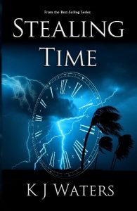
To convey the pace, I wanted to show movement in the image. I wanted the reader to feel the power of the storm with lightening striking and the palm trees flailing in the wind. I’ve indicated time travel with the clock face and the shadowy blues and greys adding to the anxiety.
I chose a font that was strong and clear, modern, nothing flowery or delicate. This cover was designed in tandem with Jody Smyers, a professional photographer who photographed the lightning specifically for the cover, and turned out so well that it inspired our venture into the book cover business. What resulted is a strong cover that makes you feel the danger and excitement of the approaching storm.
3. Hint at the Story without Being Cluttered
DonBook covers should always follow the K.I.S.S. rule (Keep it Simple Stupid.) Pick one scene from the book to convey or find an image that sets the mood — a foggy pier at dusk, a woman jumping for joy, something that captures the feeling of the story, without being too cluttered.
Don’t overdo props or try to squish multiple images on your cover. If you can’t decide on one image do a blog post to have readers vote on their favorite. Sometimes the vibe you get from the cover isn’t necessarily what others will feel – after all you already know the story, readers don’t.
Some of my competing cover businesses specialize in multiple images merged together in photo shop — like three scenes of lovers portrayed. More isn’t always better. One strong image is much better than several confusing and cluttered ones. When tugging at the target reader’s emotions, you need to go for maximum impact. Three images may convey several different emotions, or even conflict, diluting the impression, and blowing your chance at the “buy now” moment.
 Another reason you need one strong image has to do with how readers buy books electronically. The best advice I received when developing my cover was to look at is as a thumbnail before finalizing it. This is how you will sell your book on Amazon and other eBook formats. If your cover is busy and cluttered, the reader will see nothing in a thumbnail and move on. Also, if you can’t read the title or see you name in the thumbnail, redesign it so the thumbnail works as well as the full cover.
[pullquote align=”normal”]The best advice I received when developing my cover was to look at it as a thumbnail. [/pullquote]
4. Be Visually Pleasing
I’ve seen a few covers that follow all the other advice listed here but the design elements or the image is unappealing. One sticks in my mind of a very beautiful woman in a bikini on a simple white background and an alien tentacle disappearing under her. The title was “I’ve Fallen and There is a Tentacle in my Butt” Seriously, that made me want to lose my lunch. And who prey tell is that target audience? Oh, never mind I know it is men, but WHY!! It still makes my skin crawl. Memorable, check. Disgusting and revolting, check. Does this make you want to buy the book?
In addition to the basic theme of the image, your design should be high quality and look professional. Make sure the image is clear when enlarged and make sure it fits the storyline.
There is a rule in photography called the Rule of Thirds. You split the image into thirds, both horizontally and vertically, and lay out your image subject on the intersecting lines. Too symmetrical is generally not as appealing to the eye as the thirds concept. The tentacle picture did a great job of this as the woman was on 2/3 of the cover leaving a white canvas on the right and side of the image. It was the horrid tentacle that came from the top third of that right side that did me in. Visually pleasing in terms of layout but the rest…well I’ve already touched on that.
I hope this gives you some ideas for knocking it out of the park on your next book cover. If you ever want a second opinion feel free to DM me on twitter (@KJWatersAuthor) and I’ll give you my honest two cents.
I hope this gives you some ideas for knocking it out of the park on your next book cover. If you ever want a second opinion feel free to DM me on twitter (@KJWatersAuthor) and I’ll give you my honest two cents.
Go Forth and be Awesome in Your Writing Journey!
I wish you the best of luck in your writing journey. Since you’re on Rachel’s blog, I know you’re already doing the right thing by learning from her experience and advice.
Rachel, thank you again for including me in your brilliant #NANOPROMO month. I’ve known Rachel for several years and first got to know her as a guest on my podcast, Blondie and the Brit. In fact, we have just recorded a new episode that you can find here.
rocket
Day 9 Giveaway
As a special thank you I am offering a free one-hour consultation. I specialize in publishing, branding, and social media marketing, so it can be anything from publishing on Amazon, to creating your author platform, newsletters, graphics, or book covers.
All you need to do to enter is comment below.
For Everyone!
 Just so no one feels left out, there is a ton of inspiration and book marketing advice over on the podcast with my co-host Suzanne Kelman. Over the last few years we have recorded 85+ episodes with authors and other experts in the field and provide a half hour of fabulous fun filled inspiration, marketing advice, and terrific tools to make your writing life easier. We are also on iTunes for your listening pleasure.
KJ Waters…
…loves the ocean and any body of water that is warm (and clean). She is the #1 Amazon best-selling author of the short-story, Blow, and #1 best-seller, Stealing Time.
She has a Master’s in Business and over 18 years of experience in the marketing field.
Before quitting her job to raise a family and work on writing, she was the Director of Marketing and Communications for a national behavioral healthcare company.

Connect with KJ Waters
Twitter: @KJWatersAuthor
Facebook: KJ Waters
Pinterest: @kamajowa

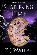
I love the cover for Stealing Time! But the tentacles cover … I guess that’s half the point. Designing a cover that appeals to our target reader, but not to others.
Your rule #3 is good. I see a lot of ugly covers but don’t always stop to think why I don’t like them. In hindsight, it’s often because they are too busy. It spoils the aesthetic.
Thank you so much for these great tips! I find that a good cover is so important to me, as an author to represent my book baby, and also as a reader, to get a sense of the story.
Practical, thank you
I love to learn about book cover designing. So many components to consider-even tentacles! Font style, size position can bother me. Thanks for all the good info!
Iola, thank you so much! The target reader is crucial, if you can nail this element you can sell your books.
I have seen my fair share of bad covers too and I always want to reach out and help them out.
The other reason covers can strike you as off without you being able to put your finger on it is if you have multiple images but the lighting is from a different angle in each one. I notice it because we work hard to avoid that issue even down to the lighting of the text.
Nice to meet you, Iola!
Thanks for the tips! I’m always looking to learn more about cover design. Getting covers just right is SO important, but also so very difficult. (I especially struggle with the fonts.)
Thanks for your time and advice.
This post is one that I’m going to read and reread, as I’m wrestling with the artwork for my first novel. Thank you for being straightforward and including such great examples. I’ll definitely remember the “tentacle cover”, even though I have no plans to buy or read the book!
Thanks so much for this. I’ve been lost in websites of book cover designs! There are many and the choices are overwhelming. You laid out a simple plan to follow for the creation of a great book cover. Thank you!
I am an amateur photographer and I completely forgot about the rule of thirds for the book cover. Now I know why our current cover just wasn’t looking right to me. Thanks for the reminder!
These are some great tips for covers. People say not to judge a book by its cover but they do!
There is so much to think about with cover design. Thanks for sorting some of this out!
I’m working on covers for a new series now, so this information is right on time!
That’s a great reminder that images can be layered so that you don’t (necessarily) need to pick just one.
For my genre, chick lit, many times fairly intricate illustrations are used, with lots of embellishments. So if I ever summon the budget and energy to rework my covers, I’d like to look into that.
I have a minor “hobby” interest in graphic design and have loved watching videos by John McWade on the topic. Who knew kerning could be such fun!
Maureen, very well summed up. It is important in so many ways.
Sorry to comment late and like this the website isn’t letting me comment in queue.
sorry, we’re having gltichy comment issues right now. My admin is working on it! x
The Rule of Thirds is fascinating–and useful–advice. I will definitely keep that in mind in the future!
When I began writing in a new-to-me-genre, I checked out the bestselling covers in it and found many authors used similar fonts, a specific way of presenting the author name, and a particular style of cover model. I guess it’s a way of shouting (in three seconds or less), “Hey! This is the genre you’re looking for!”
I really like the idea of picking an image that evokes something of the story as well–great ideas here and a lot of food for thought!
I like the idea of looking at the cover as a thumbnail pic. That’s how many people will see it when they order it online.