How to Set Your Author Website Foundation by Guest @BookWorksNYC
The Insider’s Guide to Author Websites: Set Your Foundation
An author website is the foundation upon which you build your platform. We asked BookWork’s Web Lead, Tyler Doornbos, to share his insider’s perspective on what that should entail…
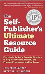
(Adapted from The Self-Publisher’s Ultimate Resource Guide created by BookWorks founder Betty Kelly Sargent and Joel Friedlander, “The Book Designer,” and winner of the 2017 Silver IPPY in Reference Book category)
At this point, you’ve heard the endless refrain: you need a website. Probably for years now. I won’t reiterate it. It feels a little 2008 to even be mentioning it.
What’s worth mentioning, however, is what your website needs. The independent author sphere is saturated with bad design and marketing—from unintentionally hilarious book covers to websites that look like refugees from the wreckage of Geocities—and you don’t want to add to it. But it goes much deeper than that. Design isn’t just how your website looks, but what it does (to very loosely paraphrase Steve Jobs), and you have to do more than just have something out there. It needs to be as remarkable as your book.
The Most Important Thing About Author Websites You’ll Ever Read (…Maybe)
Building an excellent website is one of the first priorities for every business (and make no mistake, you are a business).
You’re not just selling a book, you’re building your brand, and everything that you put into the public sphere affects the perception of your brand, and therefore your sales.
The hard truth is this: self-published authors are still fighting an uphill battle for acceptance, despite the sensational success of a few. Yes, the media (especially the self-publishing media) loves to crow about how many books are being self-pubbed, how much authors are making, how many indie author millionaires there are. But the vast majority of indie authors will sell a handful of copies to friends and family, where they will collect dust on a shelf.
Don’t be that author.
You may not be selling as much barely-masked Twilight fanfiction as E.L. James (yet!), but you can certainly look the part. Plus, you’ll have a great foundation for when those numbers do start skyrocketing.
Following is some insider knowledge from a working web design firm to help you ensure that no matter what path you choose to build your site, you’ll finish with a top-notch product.
The Golden Rules of Good Author Websites
When building your website, just keep these four rules in mind, and you should be alright. When in doubt, contact a pro to make sure you’re giving your site the attention it deserves.
- Your Author Website is the Hub of Your Brand
- Your Author Website is NOT a Brochure, Update Regularly
- You Must Be Mobile
- Repeat After Me: IT’S NOT (ALL) ABOUT YOU
1. Your Author Website is the Hub of Your Brand
It’s where every part of your communication strategy meets—click-throughs from your search engine ads, folks who heard you on NPR and want to learn more (dream big, folks), reporters checking you out for a story, readers who clicked from your Facebook page for more information, or people who picked up your literature at that reading you did last week.
For most people, their first contact with a brand will be through the web, and many of those first contacts will be at the brand’s website. Your site needs to make sure that those who stop in get a great first impression, and find what they’re looking for quickly and easily.
2. Your Author Website is NOT a Brochure, Update Regularly
“Brochure site” is web industry jargon for a static site with no interactive features, just information dumped onto a page, usually with the indifference of a lunch lady doling out sloppy joes. It also references the fact that most of those sites are updated about as often as print pieces. 
It does not have to be this way—it cannot be this way for your site to be successful. Your website is easy (and free) to update—so do it! Add a new blog post, tweak your bio, upload a new headshot. Do whatever it takes to make that site always feel fresh and cared for. Keeping your site updated will also help your chances of ranking higher on major search engines, which use frequency of updates as one of the criteria for boosting ranking.
3. You Must Be Mobile
With mobile and tablet viewing averaging around 50% of traffic for websites, you can’t afford to have a site that isn’t optimized for viewing on all devices. Most quality themes for self-hosted sites will be optimized for mobile, as will the themes at a website builder like Squarespace.
4. Repeat After Me: IT’S NOT (ALL) ABOUT YOU
See how that’s in all caps? That’s because it is the most important thing you’ll ever read about building a website. The greatest sin on the internet is vanity, and most website owners we work with are guilty of it.
While most vanity is expressed on the internet as absurd selfies posted to social media, when you run a brand on the web, vanity is the assumption that users are visiting your site to hear what you have to say, rather than coming for their own reasons.
To keep users on your site, and turn them into customers, you have to think first about what they want and why they are visiting, rather than focusing on your message. For authors, this can be a real challenge, since writing a book is so intensely personal. Break through that, however, and you can create something that is hugely beneficial for your brand.
This does not mean being all things to all people. Your book has a target market, you should be talking to them. If middle-aged readers of faith-based fiction are not your market and never will be, don’t worry if they find your website and then leave. You’re looking for qualified traffic—readers for whom your brand resonates.
The Author Website Build Process
A good website will have five phases. These apply even if you’re doing the site yourself with a website builder, and any professional worth their salt will have you go through some version of these phases. They help iron out what you need, what your users need, and how to join those needs in an effective website strategy.
- Discovery
- Information Architecture
- Content
- Design
- Development
1. Discovery
This phase lays out the basic knowledge that will form the building blocks of your site. If you’re working with a web professional, this will help them understand your brand, your book, your personality and your readers so that they can design a website that helps you achieve your goals.
This is equally important if you’re working solo because it will get you used to thinking like a business with a goal-oriented mindset. You can use a simple discovery questionnaire like this one (from my agency, Well Design) to get started.
Good discovery focuses on your goals, understanding your market and understanding your users.
2. Information Architecture
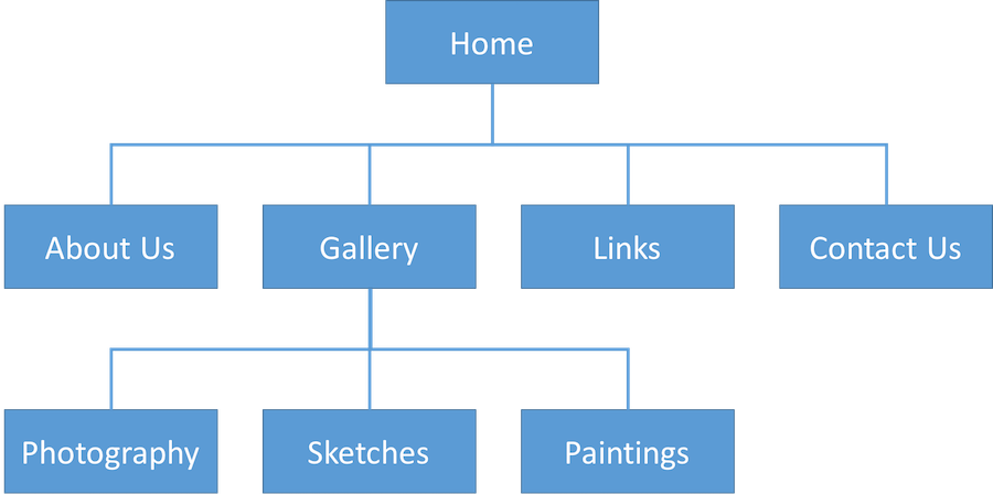
Information architecture is just a fancy way of saying, “how you organize your website.” You must decide how visitors to your site would like to see the information you want to present, and how to best meet their needs with the structure and content of your site. Need some helpful tips on structuring your content? BookWorks has you covered.
During this phase of planning, you should create a simple visual representation of your content. See below for an example of basic website information architecture. Your site doesn’t have to be much more complicated than that unless you want it to be. For more information, be sure to check out The Complete Beginner’s Guide to Information Architecture on UX Booth.
(Source: Interaction Design Foundation – interaction-design.org)
3. Content
Now you get to do what you do best—write. Using your information architecture plan from the previous step, you will create content for your entire site.
4. Design
If you are working with a professional designer, they will generally give you a few different design directions to choose from, and you can combine and revise them into something that works for your brand.
If you’ve gone the self-serve route, such as a website builder or self-hosted websites that use templates, (such as WordPress, Joomla! and Statamic) you get to be the designer.
Need an assist with designing your own site? Use templates for WordPress and other website systems from online stores like ThemeForest, TemplateMonster, or StudioPress.
Once you get rolling with these templates, particularly in WordPress, they are really quite simple to use and design with.
And if you need some inspiration, check out design awards sites like Unmatched Style, Awwwards or Behance, or simply search for “website design” on Pinterest.
5. Development
A custom website will then be coded by your web professional or agency. Website builders and self-hosted websites will have the templates already developed for you, you’ll just need to do the required setup to use the theme with your site. Processes for getting the theme installed on your site, as well as the amount of setup once the theme has been installed, vary.
If you like, you may pay about $50 to have your theme setup through ThemeForest by qualified support staff.
Testing
This can’t be stressed enough. When the site development is done, test it. After every revision during the development phase, test it. When you’re hours from going live, test it again. And don’t only test things that have changed—test it all. Test each page, each link, each product. Test the site in the four major browsers (Firefox, Chrome, Safari, and IE11+) to make certain that users can see your site and brand as you intended them to. Then grab your tablet and mobile and start all over again. Testing is grueling but absolutely necessary.
Choosing Your Provider
There are myriad ways to build a site today—from excellent website builders like Squarespace to self-hosted WordPress templates—but the gold standard remains having a professional plan, design, and build your site.
What to Look for in a Web Designer
Anyone can say they’re a web designer—there are no credentials or certifications needed. But finding one that has the right mix of design sense, industry knowledge, and the ability to finish their projects on time and on budget can be a challenge.
When looking for your web designer, treat the process like you were hiring an employee at a business.
Ask for References
Testimonials on the designer’s website are great—but you should request direct references, and actually call them. Even clients who love a particular designer will have something to say that can help you work with the designer successfully should you hire them.
Study Their Work
Does their design style match what you’re looking for? Do they have experience creating sites for authors? Do the sites they link to in their portfolio achieve the goals of their owners? Are the clients’ brands represented well?
The proof is in the portfolio. Don’t merely glance at the work they’ve chosen to show there.
Look for Credentials
While web design is a profession that only requires a computer and some know-how, good designers will often be recognized by third parties. Check to see if their work has won awards, been featured in media outlets, or has earned some sort of credentials, such as a certificate in one or more of their key skills.
Take the Interview Seriously
When you finally get past perusing designers’ sites and move into the hiring phase, you’ll be speaking with or corresponding via email with a few different prospective providers. These exchanges should sound and feel like job interviews—because that’s exactly what they are, and you’re the boss. What interview questions would you expect to be asked if you were applying for this job?
Ask the designer about how they work on their projects, and what steps they take in creating a website. Find out what work they are particularly proud of and why. Ask them what they feel their weaknesses are, and how they compensate for them.
In conclusion, regardless of how you decide to build your site, be it DIY or hiring a professional (such as BookWorks’ preferred website partner, Featherlight) to do the hard work for you, you’ll need to have a lot of input in the process. Remember, your website is not just a requirement of modern marketing—it’s a launch point or endpoint for what a potential reader will do next after discovering your book. A poor site will stop them dead in their tracks.
Use the insider info we’ve provided to start your website build off on the right foot (or revamp your existing site) and to ensure that you get the product that your brand deserves.
Part One of a 3-part series: An Insider’s Guide to Author Websites
Part Two: Essential Component Checklist Part Three: Execute!
If you aren’t already a member of BookWorks, please check us out for more great content from our Team of Industry Experts and join our community of indie authors, editors, coaches, designers, marketers, bloggers, and other self-publishing pros.
“
The Self-Publisher’s Ultimate Resource Guide: Every Indie Author’s Essential Directory to Help You Prepare, Publish, and Promote Professional Looking Books
rocket
THE GIVEAWAY
1 Free Month Sidebar Display Ad on BW site: 250×250 sidebar ad for your book or promotion ($40 value)
and
1 Free download of The Self-Publisher’s Ultimate Resource Guide by Betty Kelly Sargent and Joel Friedlander
Want to win this giveaway? Simply leave a comment WHY below!
All comments must be left prior to midnight on Monday, May 20th, 2019 in order to be eligible to win. Winners for the week announced on Tuesday, May 21st.
Good luck!
Tyler Doornbos | BookWorks
For a more detailed plan on developing your book marketing, purchase Rachel’s new book,
The BadRedhead Media 30-Day Book Marketing Challenge now on Amazon!
Already a 5-Star Reader’s Favorite!
Have you signed up for my newsletter yet?


Wow – so much fabulous information! I need to get my a** in gear over this next month. What I have isn’t working – for a huge variety of reasons – I’ve moved a lot into nonfiction, I’m questioning my novel, and so on. I’d love to chat!
Tyler,
With it being Sunday, I think most people are still at church. Your post is as comprehensive as they come, very informative. I did not know by “Keeping your site updated will also help your chances of ranking higher on major search engines, which use frequency of updates as one of the criteria for boosting ranking.” That’s beneficial information to all those with websites and blogs.
Rachel has gone above and beyond in providing some of the very best guest posts for #NaNoProMo 2019.
Sincerely,
Donna
I would so love to have that book! I’m still learning everything I can about self-publishing. 🙂 Websites are also an area I’m learning about…slowly lol.
Wow. All things I didn’t think about when it came to websites. Thank you!! I will have to give my “in house tech support” (aka my husband) this info. Je would better know how to put this into motion.
Wow. You have me thinking about things I’ve never considered before. I’ve been pretty pleased with my website design, wanting a clean, easy-to-read site that’s also easy to navigate. I like blogging, so my site isn’t static–it’s updated regularly and I have over a thousand subscribers. But your post here makes me realize there are a lot of things I haven’t thought about, and I really need to do an overhaul. Thanks for sharing your insight!
I can spend many happy hours tinkering with my own website, and it’s surprising how quickly information can get out of date… “coming soon” becomes “now available” and “upcoming talk” becomes “catch the replay here”, for example. Thanks for the reminder to test widely, too. It’s scary how different things can look on different devices & browsers.
This is a well-written and user friendly article about a tricky subject. Web design can be so daunting to authors because it combines two areas where many have issues (IT and marketing). Okay, maybe it’s just me. Anyway, I appreciated all the checklists and references included. This is a complex subject, but also an important one. Thanks so much for helping to make it easier.
Sincerely,
Dana Lemaster
I love this idea Rachel. Folks ask how I promote my 100 plus eBooks. Thru my blog. Sure I Tweet Amazon Associate links too but listing thru my blog and building my tribe boosts my sales.
Fab info and certainly some tips I can take on board. I was glad to read some of this and feel I already had some of this in mind. Jen
Thanks for these amazing tips really helpful and worth sharing.
I’m certainly reconsidering all aspects of my website now. While I like to think it is in decent shape, I will take a closer look and try to put myself more in the reader’s shoes.
As always, even though I’ve been doing it a while now, I know I don’t know everything about self-publishing. There is always more to learn, so I would love to see what I can be taught. In addition, a little extra advertising never hurts. This package is a great giveaway.
Thanks, Rachel, for always providing great content and professionalism. #NaNoProMo is one of my favorite events of the year!
Something is amiss with my website. Enjoyed reading this article, would love to have the resources. Plus an ad! Goes without saying