This is How to Safely Choose Colors for Your Author Website by Guest @ThDigitalReader
Choosing colors for an author website can be daunting. I should know (I’ve built more sites than I can count).
The colors on an author website need to send an important message to visitors, telling them what you write about, while at the same time bringing the visitor’s attention to the more important parts of your site. The site’s colors need to complement each other and the text in such a way that looks both vibrant and professional.
Color choice is incredibly important, and yet this is still something that even graphic designers get wrong. Negative outcomes abound, including aiming for colorful and instead ending up with garish, or choosing accent colors that distract attention from the text, or even worse choosing a background that renders the text illegible.
And just to add more complications, author websites have a burden that other websites do not: The site’s color scheme has to agree the author’s book covers. (This is harder than you might think.)
This topic is fraught with peril, so I thought it would help if I shared my system for choosing website colors.
But before I explain how I choose colors, I think I should explain how to avoid making mistakes.
THRU MAY 15
Enter this massive Rafflecopter giveaway!
 Click Here for the Rafflecopter Giveaway
How Not to Choose Colors
Generally speaking, I don’t use very many colors on a website. While some designers recommend using a palette of four to five colors, I rarely choose more than two accent colors.
While that sounds boring or bland, there is a method to my madness: I limit my color choices in order to make book covers look their best and to make sure the website’s text is as legible as possible. This is why I do not try to get creative with the background color or the text color.
Background
For starters. I usually leave the background color white because it is a neutral color, and that is usually the best color to compliment book covers. Remember, you want the book covers to stand out, so they need to be more colorful than the background.
Also, did you know that the background color can trick the eye and make your visitors think that your book covers are faded or use colors other than the ones you chose?
Let me give you an example. As you can see in the following images the squares labeled A and B appear to be entirely different shades, but in reality, they are actually the same shade of gray.
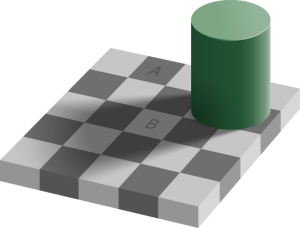
By Original: Edward H. Adelson, vectorized by Pbroks13. – Own work, CC BY-SA 4.0, https://commons.wikimedia.org/w/index.php?curid=75000950
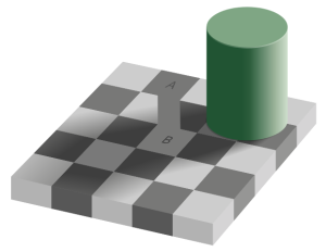
By Original by Edward H. Adelson – File created by Adrian Pingstone, based on the original created by Edward H. Adelson, Copyrighted free use, https://commons.wikimedia.org/w/index.php?curid=45737683
I can’t actually tell you how the background color will affect your book covers because the possible conflicts are boundless, but I do know that white is a safe choice, so I try to always go with white.
Text
As a rule, I usually leave the text color either a black or dark gray (on light background) or white (on dark backgrounds). This maximizes the contrast between the colors, thus making the text more legible for those of us with limited vision while at the same time avoiding a text/background combination that will be illegible to those with color blindness issues.
Many designers will choose a medium shade of gray on a white background because that meets the minimum standard for contrast and legibility. Or they might choose a different color because it is prettier than black.
The medium shade of gray is a bad idea because that forces readers with vision problems to struggle to read the text. Also, using a pretty color for the text can lead to problems when the text color clashes with the background color. Some combinations are illegible to all, while others such as red-green can be illegible to those with color blindness issues.
I do use some color on websites, so why don’t I explain how I choose the colors.
Discover the solutions that make tech headaches disappear so you can focus on your next book.
How to Choose Colors for Your Author Website
Everyone knows that you should choose a color palette for your website that either expresses your personality or defines your brand. That is generally sound advice, but what does it mean for author websites?
I have always taken that to mean that the colors of an author website should give visitors clues about the genre or non-fiction category that the author writes. This can cause complications or conflicting color choices for authors who write in multiple genres, but it’s still a good place to start.
Non-Fiction Authors
Look at the topic you write about, or the industry you work in, and ask yourself if there are any colors that make people think of your topic or industry… Greens and browns, for example, make people think of the environment, while black and yellow paired as alternating stripes will make people think of caution tape, or police tape.
What colors do you think of when your topic or industry comes to mind?
Fiction Authors
While non-fiction authors often have broad latitude for choosing colors for their website, fiction authors sometimes have very limited choices and run great risks in choosing the wrong colors. Romance, for example, has many subgenres, each with its own shade of red, pink, or maroon.
Using the wrong shade will lead visitors to conclude that an author writes contemporary romance when the author actually writes paranormal romance (just to give you two very different subgenres).
If you’re not sure what color goes with your genre, here’s my trick for choosing colors: I do is do a Google image search for the genre or subgenre plus the words “book cover”.
The thing about book covers is that cover designers also use colors to send signals to readers, just like authors need to do with their websites. Readers might not be able to tell you which genre uses which color, but they will be able to tell you a book’s genre by the color of its cover. (It is almost instinctual at this point.)
For example, if I were working with an SF author, I might search for “space opera book cover”. This generally turns up a few dozen book covers, giving me a good idea of what colors are being used in that subgenre.
As you can see in the following image, the above search shows that black is the base color for this subgenre, with accents supplied by green/yellow, blue/red, or blue/purple gradients.

BTW, I hope you noticed that most of these covers only use 2 or 3 colors (plus the font colors), just like I recommended for an author website. Note how the fonts really stand out on some covers (this is a sign of a good design).

Now that you have a good idea of how to choose colors for your author website, I have a few additional tips for you, including advice on where to go next.
Choosing website colors can be a lot of fun, but it is also far too easy to get swept up in the moment. I can’t tell you the number of times I have come up with a good design, and then kept tweaking it to the point that I ruined it. Don’t make my mistake, either know when to stop, or at least develop the habit of saving multiple copies of your work. This will let you go back to an earlier set of colors, and work from there.
In addition to choosing colors for your site, you should consider whether you could use any patterns (herringbone, hexagon, etc) you might use on your site in place of or in coordination with your site’s colors. The right pattern can sometimes tell your site’s visitors the genre or historical era you write in by reminding the visitor of wallpaper or tile work from that era.
And while you are looking at colors, you might also consider how you could use photos and images to decorate your site. This is a long topic in and of itself, which is why I can’t discuss it here.
THE GIVEAWAY
A 90-minute consultation with Nate Hoffelder, (The Digital Reader) on your author website
We can discuss whatever you like, including whether it gets the message across, its technical operations, how you might add a new feature, update the look, and so on.


Want to win this giveaway? Simply leave a comment WHY below!
All comments must be left prior to midnight on Thursday, May 14th, 2020 in order to be eligible to win. Winners for the week announced on Friday, May 15th.
Good luck!
Nate Hoffelder
I am a shy and geeky stay-at-home web developer and founder of The Digital Reader, an independent digital publishing news blog for authors and readers.
In 2010, I launched (and continue to run it to this day) The Digital Reader as a blog, and built it into a publication that regularly breaks industry news, while at the same time I taught myself all the tech skills required to maintain, protect, and update the blog.
With dozens of successful projects under my belt, as well as legions of happy customers, I have successfully stewarded The Digital Reader and other sites through make or break events like website hacks to site migrations.
If you would like to see examples of the advice I can give, here are a few of the articles I wrote for authors.
For a more detailed plan on developing your book marketing, purchase Rachel’s new book,
The BadRedhead Media 30-Day Book Marketing Challenge
Now on Amazon!
Readers’ Favorite Silver Award Winner!
Have you signed up for my newsletter yet?


Thank you for the insight. I will be starting my own author’s website and refer back to this when I get all my ducks in a row.
Glad I could help!
I have to confess, a lot of what you’re saying here I arrived at through my own experiences with other people’s sites rather than a thought-out logical approach, but it’s interesting to me to see how much further I could have taken this! Very good information here!
That is how I learned this as well.
Yes! I’ve worked with some authors with several books published and little common ground in how their covers look. It really does make website color choices incredibly challenging 🙂
I never really thought about how my book covers look when paired with my website background, so I’m definitely thinking carefully about colour palettes now.
Great insight on websites and color scheme Nate. It’s good to get a better idea of your skills and what you do. I recently changed my sites look and colors to better meet my books and genre. Everything said here I can totally relate to and understand.
Thanks, Justin!
Very interesting. Thanks, Nate.
You’re very welcome, Alexandria!
I’m a huge believer in the power of color in marketing. As a marketing director by trade, I enjoyed having it explained in the world of writers, both for websites and books. Thanks!
Great point about medium grey color being bad for website text. I’m baffled how designers don’t understand it and use it often. It’s hard to read even for younger folks sometimes, esp. with thin font.
Definitely a very inconvenient mistake!
I really wanted to make my site by myself – taking into account my preferences. But I also wanted the design of my site to appeal to visitors. I have tried many patterns and combinations. Thanks for your advice guys! With this article, I found a solution that I really like!